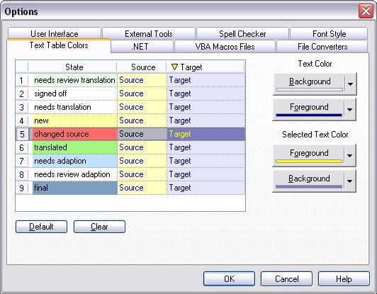
The Text Table Colors property page (see figure below) is used to determine the following display options for RC-WinTrans' Text Table view:
1. |
The color of the text and the cell background for the "Source" and "Target" columns. |
2. |
The colors that will be used to represent an item's state (e.g., "new," changed source," etc.) |
|
Interactive Display |
The display on the left side of the property page is interactive. Click on one of the states listed in the first (far left) column ("State") to determine the color that will be used to indicate that state in the Text Table view. Click anywhere in the middle column ("Source") to select the text/cell color for the "Source" column display in the Text Table view. Click on the last (far right) column ("Target") to select the text/cell color for the "Target" column display in the Text Table view. A yellow triangle appears on the column header of the active column (the one for/in which colors are being defined).
|
Color Selection |
After activating the desired column (or cell in the case of item states) in the display, select a color by clicking on the appropriate button on the right side of the Text Table Colors property page. The Text Color buttons correspond to the cell color (Background button) and the text color (Foreground button) that will be used in the Text Table view. The Selected Text Color buttons correspond to the cell color (Background button) and the text color (Foreground button) that will be used when an item is selected in the Text Table view. When determining the color of a certain state, use the top (Background) button, the only color selection button that can be used when the "State" column is the active column in the display on the left side of the property page.
|
Default/Clear Buttons |
Pressing the Default button will reset all the dislay colors back to the original (or default) settings. The Clear button removes all the color settings for the Text Table view's item states and "Source"/"Target" columns display.
